
How hard is it to migrate a Power BI dashboards to Databricks AI/Dashboard?
Automating Power BI to Databricks AI/Dashboard with a Claude reusable skills file

In this blog I explore how to automate the migration of Power BI dashboards to Databricks AI/BI Dashboards using Claude Code and a reusable skills file. The aim is to convert Power BI semantic models, visuals, and interactions into working Databricks dashboards and to build a skills file that anyone can pick up and use.
The full repo for the migration, the reusable skill files and the 3 examples can be found here.
Why Even Go There?
For a while I have been struggling to facilitate some standard way of working with Databricks and BI tools. Even though there are direct connections, to actually fully and consistently operationalise the adoption, governance is a difficult task in an enterprise setting. When teams are migrating their workflows to Databricks, they want to keep using the BI tools they are used to and connect them with Databricks. Databricks has the capabilities that a lot of these tools provide in terms of ETL, but because Business as Usual (BAU) should not be hindered in projects like migrations, the decision is usually not to replace these tools with Databricks just yet. So what is my problem? Let me explain.
Governance
With Databricks, the governance story is straightforward: Unity Catalog provides unified access control across all data assets. For native AI/BI Dashboards, that’s where it ends. The moment you introduce an external BI tool, that clean story breaks down.
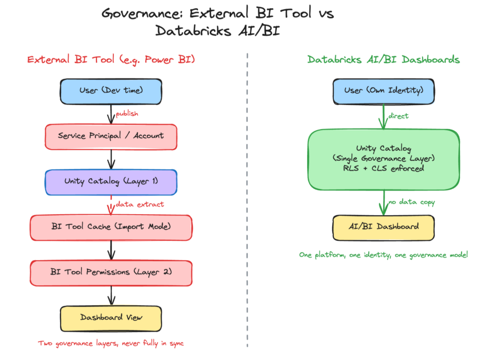
The core problem is the gap between development and production. During development, everything looks fine analysts connect with their own identity, and Unity Catalog enforces permissions as expected. But the moment a dashboard is published, scheduled for refresh, or embedded, the authentication model changes. BI tools switch to service accounts or service principals, not end-user identities. With import mode the most common pattern data is extracted and cached inside the BI tool, where Unity Catalog has no visibility at all. The result: governance splits in two. One layer controls what the service principal can access in Unity Catalog, and a separate permission model inside the BI tool controls who sees what. Two systems, doing the same job, never fully in sync.
Access latency: Every new BI connection requires securely configuring non-personal authentication, routing data owner approvals, and provisioning access adding days of delay before users can actually see their data in the tool.
Drift and inconsistency: When a team’s access in Unity Catalog changes new sources added, permissions refined those changes don’t automatically flow through to the BI tool’s non-personal authentication. Someone has to manually replicate the changes, and until they do, what users see in the BI tool diverges from what they’d see in Databricks.
Duplicated governance: In practice, organisations end up maintaining access policies in two (or more) places: Unity Catalog for the platform and a separate permission model inside the BI tool. Keeping these in sync is a constant, error-prone operational burden.
Unhappy everyone: End users are frustrated by slow access. Platform and ops teams are burdened with manual, repetitive provisioning work across multiple systems. Nobody asked for this, nobody enjoys it, and it scales poorly.
With Databricks AI/BI Dashboards, the story is quite different. Users authenticate with their own identity, Unity Catalog enforces governance in real time, and there is no secondary permission layer to build, sync, or maintain. One platform, one identity, one governance model.
Costs
I have been seeing this discussion come back more and more around BI licensing and additional costs. Databricks collapses the BI layer into the data platform itself no extra licences, no data copies, no separate infrastructure. Dashboards are just another workload on the platform you already run, while most BI tools continue to add cost and complexity as you scale.
The cost model of AI/BI Dashboards in Databricks is simple. You only pay for the SQL warehouse compute behind them every click, refresh, or Genie question triggers queries, and that’s where the cost sits. The same applies to Databricks Genie, which can be embedded in your dashboard: every question it answers runs queries on the underlying SQL warehouse at your expense.
Time to Insight
Anyone who has worked with BI tools and non-technical users knows that dashboard requirements rarely stay fixed business questions evolve, priorities shift, and the feedback cycle between “this isn’t quite what I meant” and a corrected visual can span days across separate tools. Having data, logic, and dashboards on one platform compresses that loop considerably.
With traditional BI tools, a new dashboard doesn’t start with building visuals; it starts with infrastructure. Configuring gateways, setting up service accounts, and registering data sources all happen before anyone sees a chart. Databricks AI/BI Dashboards remove most of that setup by querying Unity Catalog directly no data extraction, no gateway, no connection strings to maintain.
The data preparation work itself doesn’t disappear aggregations, joins, and transformations still need to be built regardless of the tool. The difference is the engine: Spark distributes computation across a cluster and Photon accelerates it natively, which matters as data volumes grow beyond single-machine limits. Materialized views can pre-compute expensive aggregations and refresh incrementally, keeping dashboards fast without recomputing on every load.
The Migration Approach
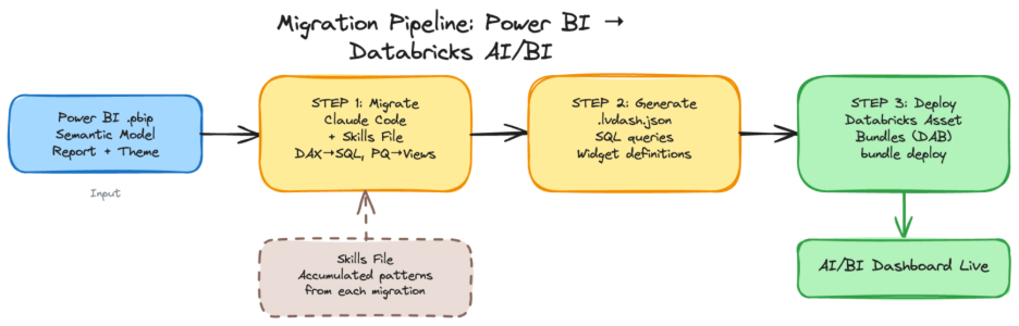
I used Claude Code to set up a project containing Power BI reports, to create the Databricks AI/BI Dashboards according to the skills file, and to deploy them with Databricks Asset Bundles (DAB). The aim is to figure out the proper instructions and construct a Claude skills file that can adapt Power BI dashboards to AI/BI dashboards directly. In addition, the effort is not limited to a one-to-one matching of the visualisations but also to mimic the interactions and to construct a dataset that can produce the expected results. For this reason, the project is looking into an overall migration from Power BI to Databricks AI/BI Dashboards.
To get a head start I used the skills file from Cauchy blog from Steven Kempers: Claude meets JSON: Automating Databricks Dashboards. Another available skills file is aibi_dashboard from Databricks. I used the same skills file and the deployment method to create and deploy the Databricks dashboard.
I used three different Power BI reports to investigate multiple components. On the first dashboard (Bakehouse Sales) I wanted to investigate what happens when a table has DAX measures, transformations, and Power Query code. On the second dashboard (Adventure Works) the aim was cross-filtering a characteristic that is very important for Power BI reports and expected behaviour. On the third report (Sample Superstore) the aim was to test the skills file.
Dashboard 1: Bakehouse Sales
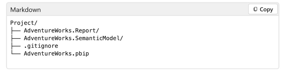
I started by creating my own Power BI dashboard including the semantic model with data from the Bakehouse sample in Databricks. The idea is to export it as a .pbip file, which is a readable version of a Power BI file containing a collection of the Semantic Model, Report Visuals, and the Theme and it looks like this.
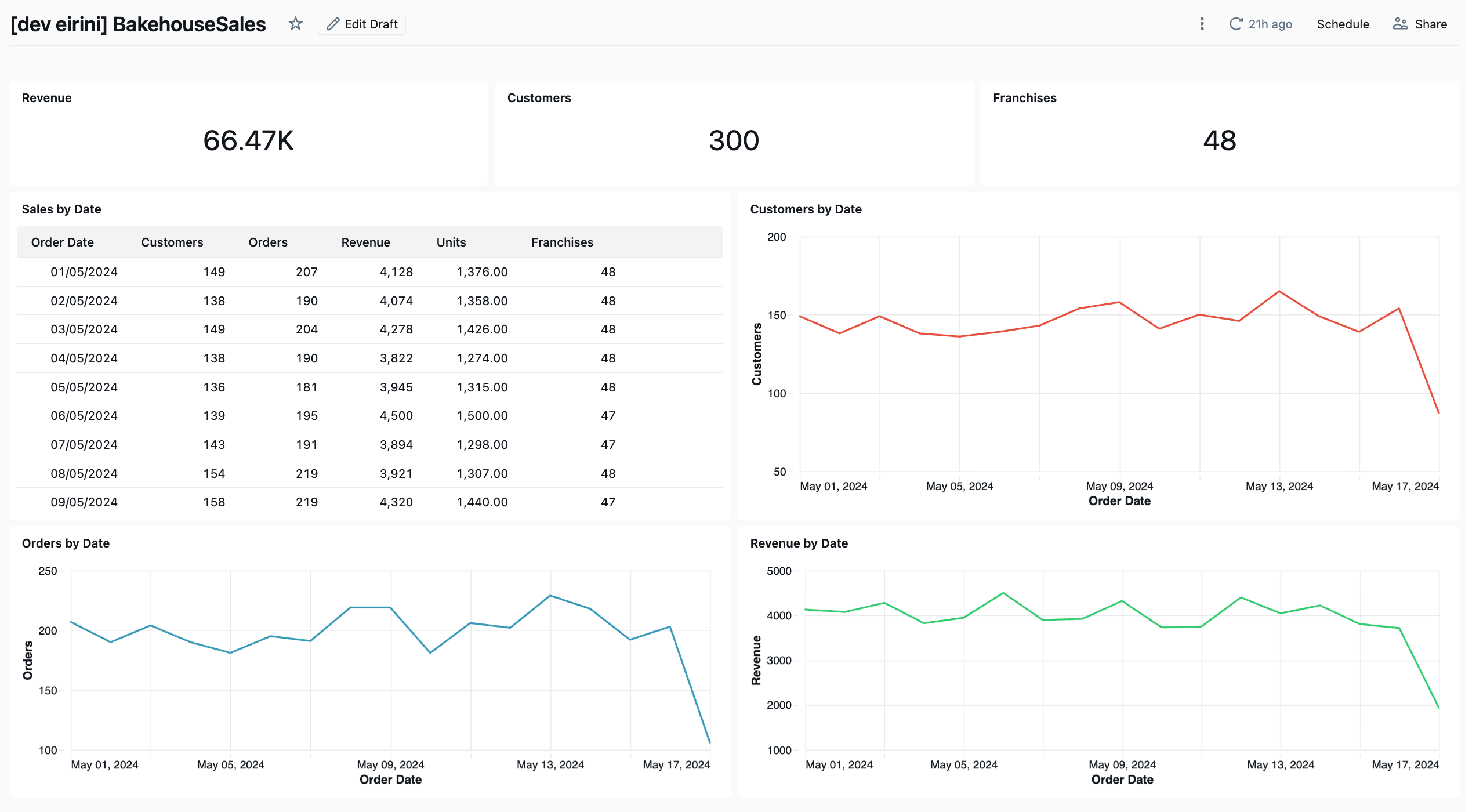
This information would be read by Claude and migrated into a Databricks dashboard, which is a single .lvdash.json file containing SQL queries and widget definitions. I tried to split the process into three tasks.
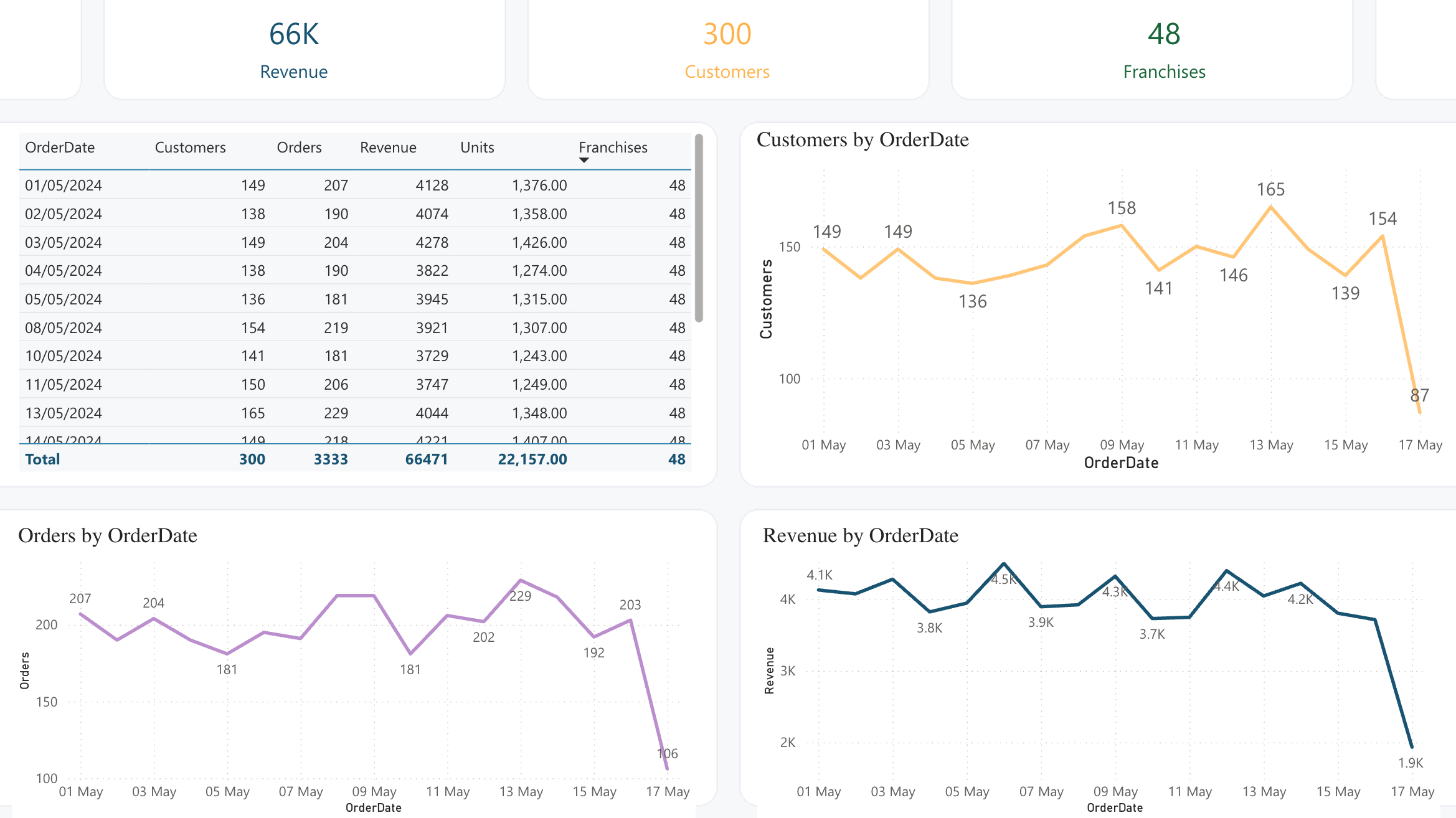
The BakehouseSales dashboard was intentionally simple but not trivial. It tested:
Can the migration handle Power Query transformations (column renaming, text trimming, calculated columns)?
Can the migration convert DAX measures to SQL aggregations?
Can the migration reproduce a calculated DAX table (
CALENDAR+ADDCOLUMNS) as a SQL view?Can the migration produce working visuals (cards, line charts, tables)?
Because of DAX and Power Query, my direction to Claude was to create SQL views for each table that has transformations, keep the same column names to match exactly with Power BI, and to only migrate what is exactly used. After a couple of back and forths, the results surprisingly matched relatively fast. These are the lessons learned that are included in the skills file:
Lessons Learned from BakehouseSales
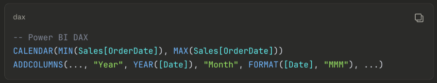
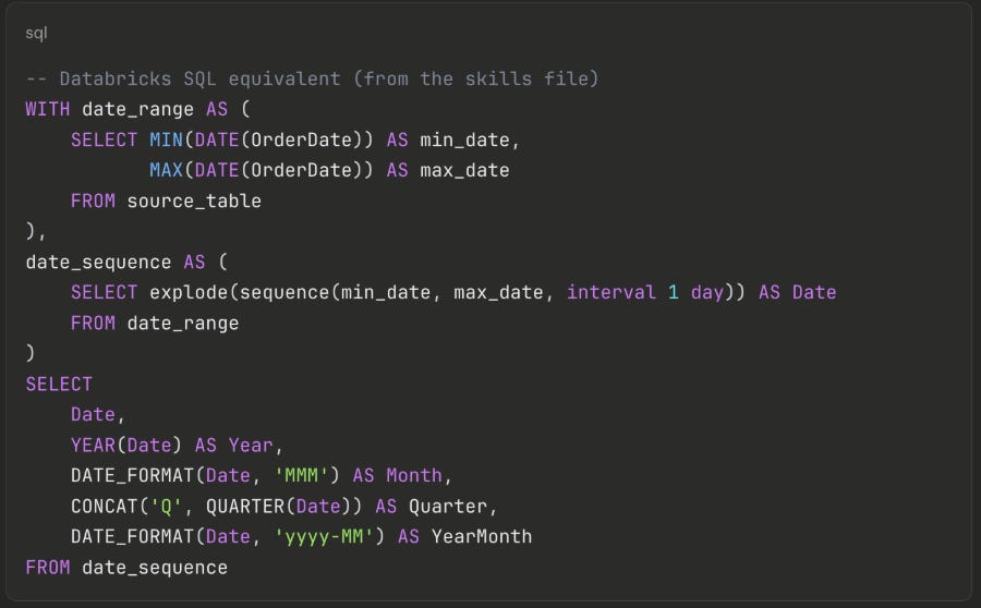
When something’s wrong, it’s always about dates: A DAX date dimension built with
CALENDAR+ADDCOLUMNShas no direct SQL equivalent — and this was the first thing that broke. The solution isexplode(sequence())combined withDATE_FORMAT, which the skills file now captures as a reusable template:
Not obvious, but now any future migration gets this for free.

Table widgets are verbose and strict: each column needs ~20 lines of boilerplate, and the widget breaks silently if you miss
disaggregated: true,spec.version: 1, orinvisibleColumns: [].Only migrate what’s used: the semantic model is a reusable data layer that often contains more than what the report displays. A migration only needs to reproduce what the visuals actually reference.
The colours are not matching: but I am willing to let it go.
The full mapping between Power BI and Databricks can be seen in the skills files of the repo.
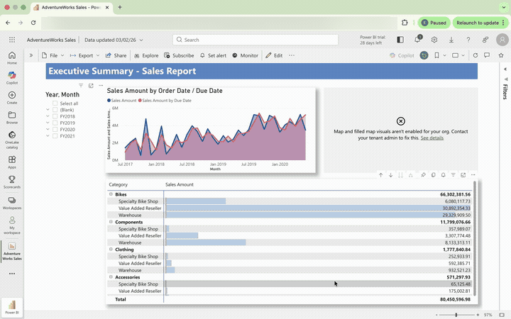
Dashboard 2: Adventure Works
The AdventureWorks dashboard was an existing Power BI report with more complexity: multiple tables joined together, a filled map, and most importantly slicers. The aim was to test cross-filtering, the behaviour that Power BI users rely on most and take for granted.
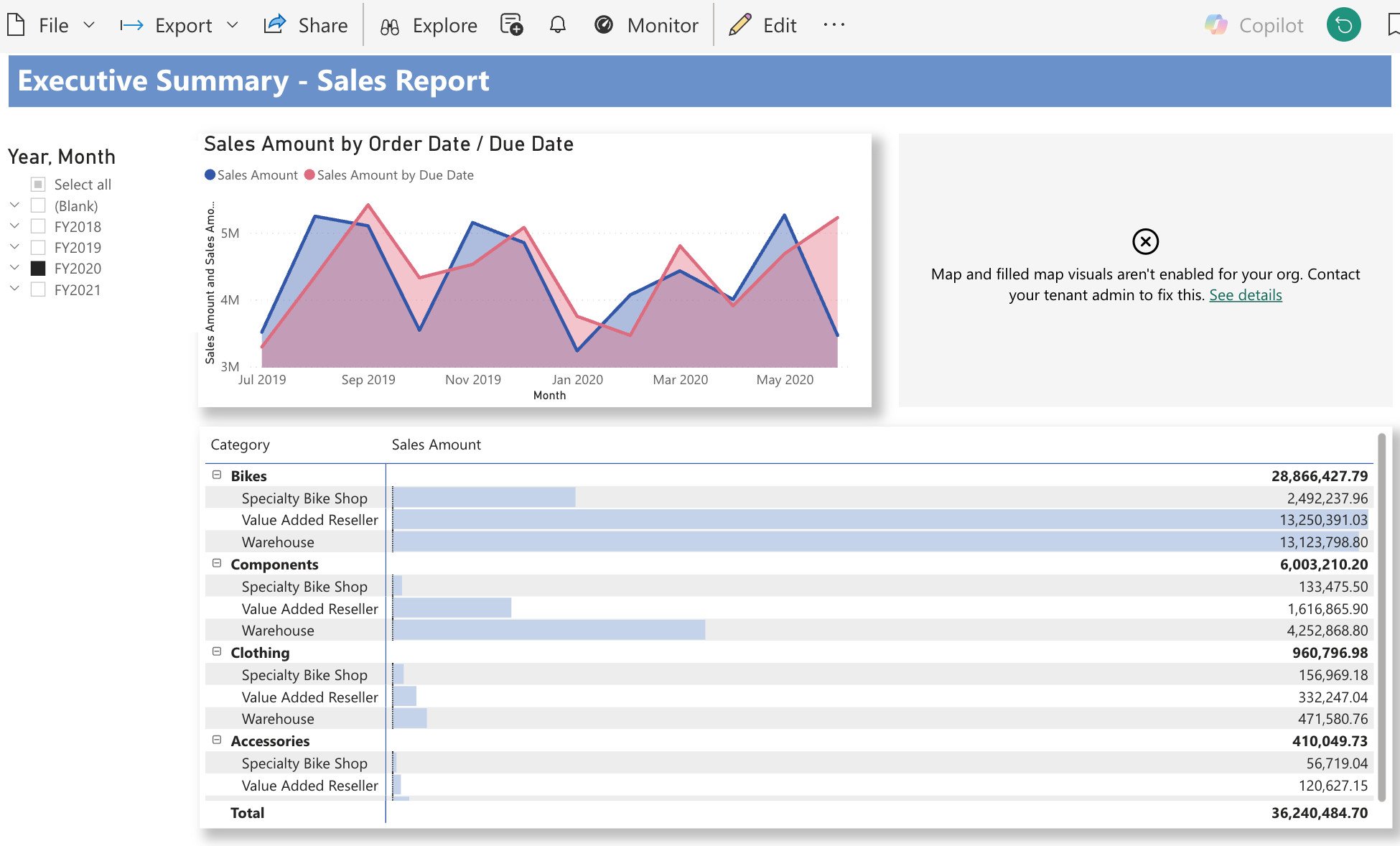
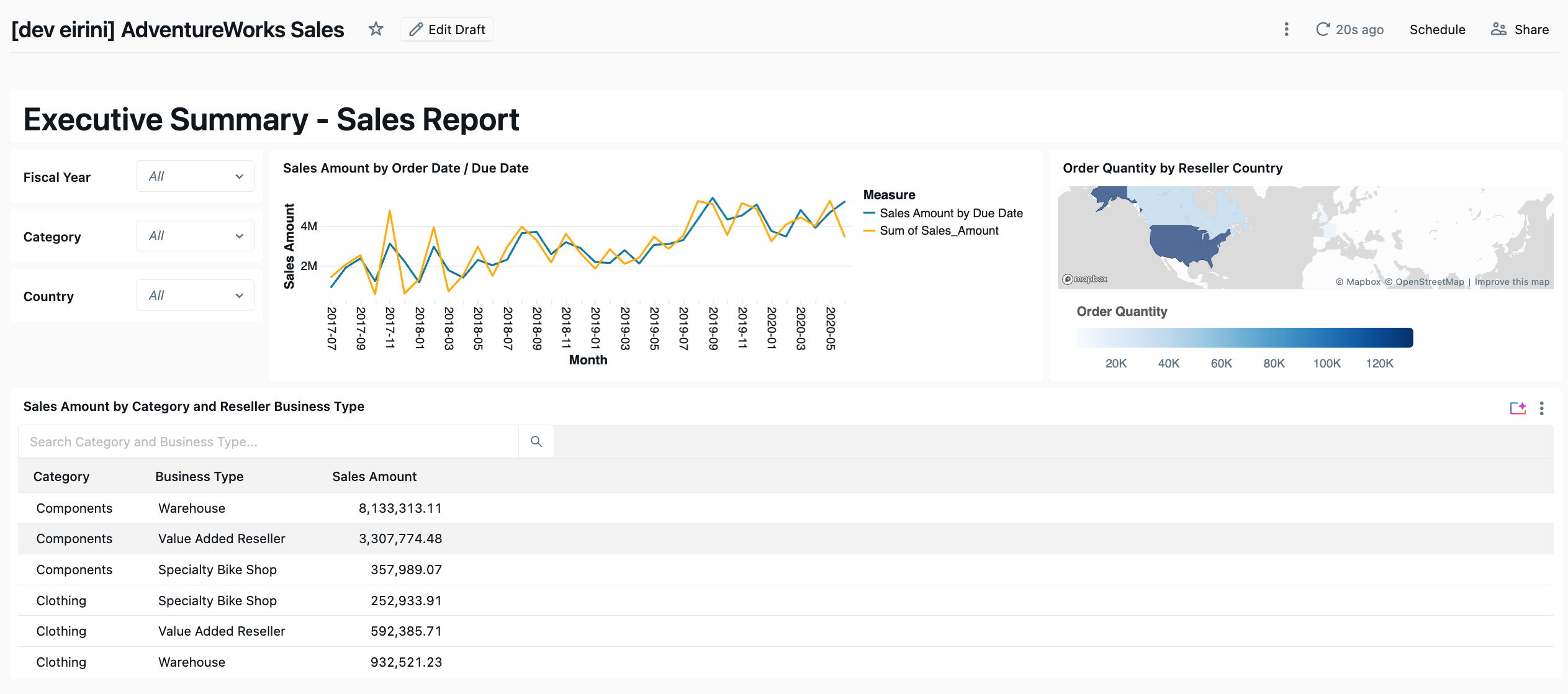
The Filter Problem - The Biggest Surprise
Challenge: In Power BI, you drop a slicer on the page, connect it to a field, and it automatically shows a dropdown list and filters all visuals through the semantic model. It is effortless. My first attempt used parameter-based filtering defining parameters in the dataset with WHERE col = :param_name. I deployed it, opened the dashboard, and instead of a dropdown list I got a text input box. Users would have to type the exact value. No list, no autocomplete.
Solution: The fix was field-based filtering: the filter widget queries a field from the dataset, populates a dropdown from the distinct values, and handles filtering client-side. No parameters, no WHERE clause. The difference in the JSON is subtle, but the behaviour is completely different. This distinction cost several deployment cycles to figure out and was not clearly documented.
Cross-Filtering — Replicating Click-to-Filter
Challenge: In Power BI, clicking on a bar or pie slice automatically filters every other visual on the page. In Databricks, this only works between widgets on the same dataset.
The AdventureWorks line chart needed a UNION ALL of two queries (Sales by Order Date and Sales by Due Date). But putting the choropleth map and table on the same UNION ALL dataset caused double-counting — every row appeared twice. We tested a single dataset; the numbers were wrong.
Solution: The solution was two datasets connected by filter widgets that reference both. A single filter widget can query the same field from multiple datasets. When the user selects a value, both datasets filter simultaneously. This required adding JOINs to the UNION ALL dataset so that categorical fields (Category, Country) existed in both datasets. The rule that emerged:
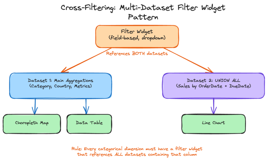
Every categorical dimension visible or clickable on the report must have a filter widget that references all datasets containing that column.
In Power BI, this happens automatically. In Databricks, you build it explicitly.
The Choropleth Discovery — Reverse-Engineering Widget Specs
Challenge: One visual was a filled map showing order quantity by country. Claude guessed the JSON encoding structure widgetType: "choropleth", version: 3, a flat geo encoding. I deployed it. The widget rendered with “Visualization has no fields selected.”
Solution: Rather than continuing to guess, I asked Claude to query the Databricks Lakeview API (GET /api/2.0/lakeview/dashboards/<id>) to export a working choropleth created manually in the UI. Three things were wrong: the widget type is "choropleth-map" (not "choropleth"), the version is 1 (not 3), and the region encoding uses a nested admin0 object with geographicRole.
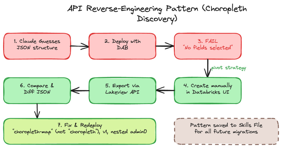
This pattern create a working example in the UI, export via API, use the result as a template became a reliable fallback whenever documentation is incomplete.
Lessons Learned from AdventureWorks
Field-based, not parameter-based: parameters create text inputs; field-based filtering creates dropdown lists. For Power BI slicer behaviour, always use field-based.
UNION ALL breaks cross-filtering: when one chart needs
UNION ALL, use separate datasets and connect them with multi-dataset filter widgets.When documentation is sparse, use the API: export a working dashboard via the Lakeview API to reverse-engineer the correct JSON structure.
Dashboard 3: Sample Superstore
The Sample Superstore was an existing Power BI report with a single table (Orders), no DAX measures (just direct SUM aggregations), and no Power Query transformations. The data was already in Unity Catalog. The aim of this dashboard was to test the skills file could Claude generate a correct dashboard using the patterns documented from the first two migrations?
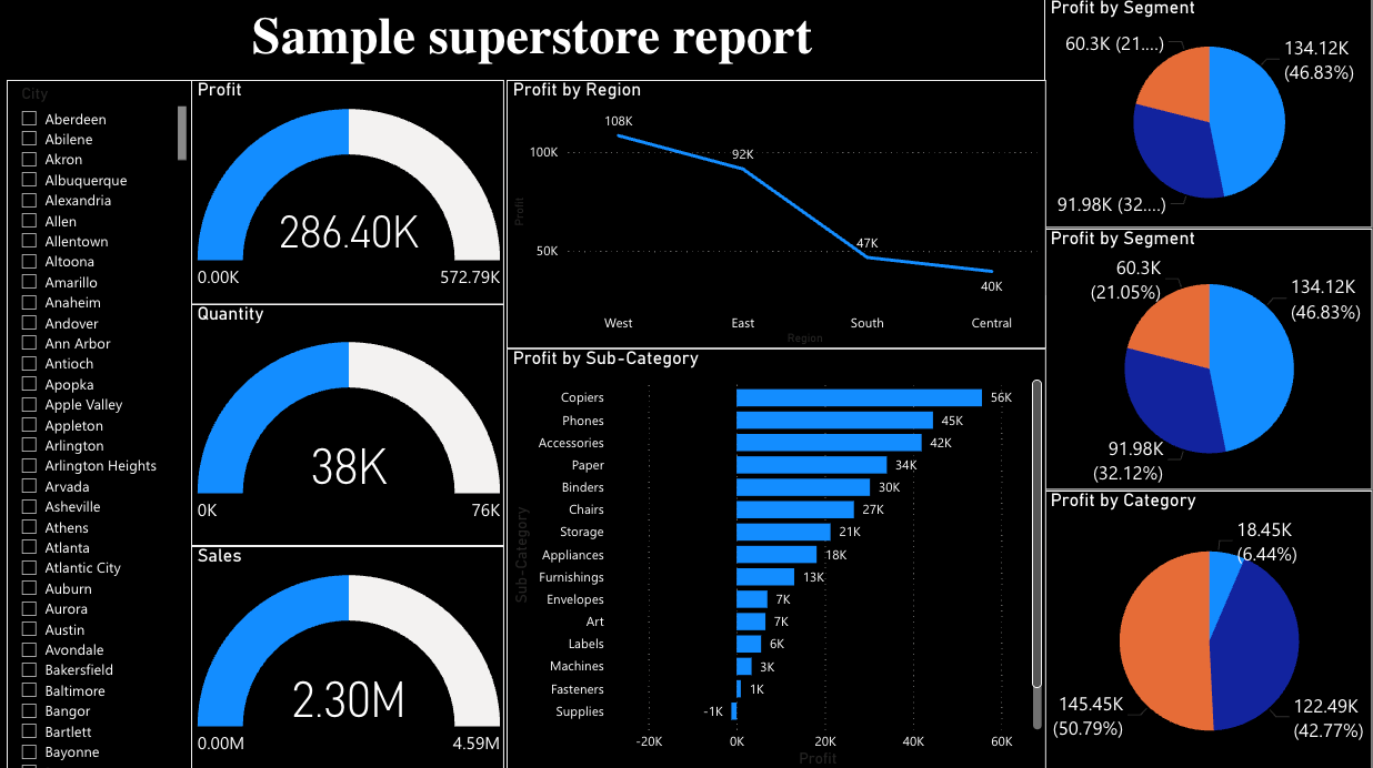
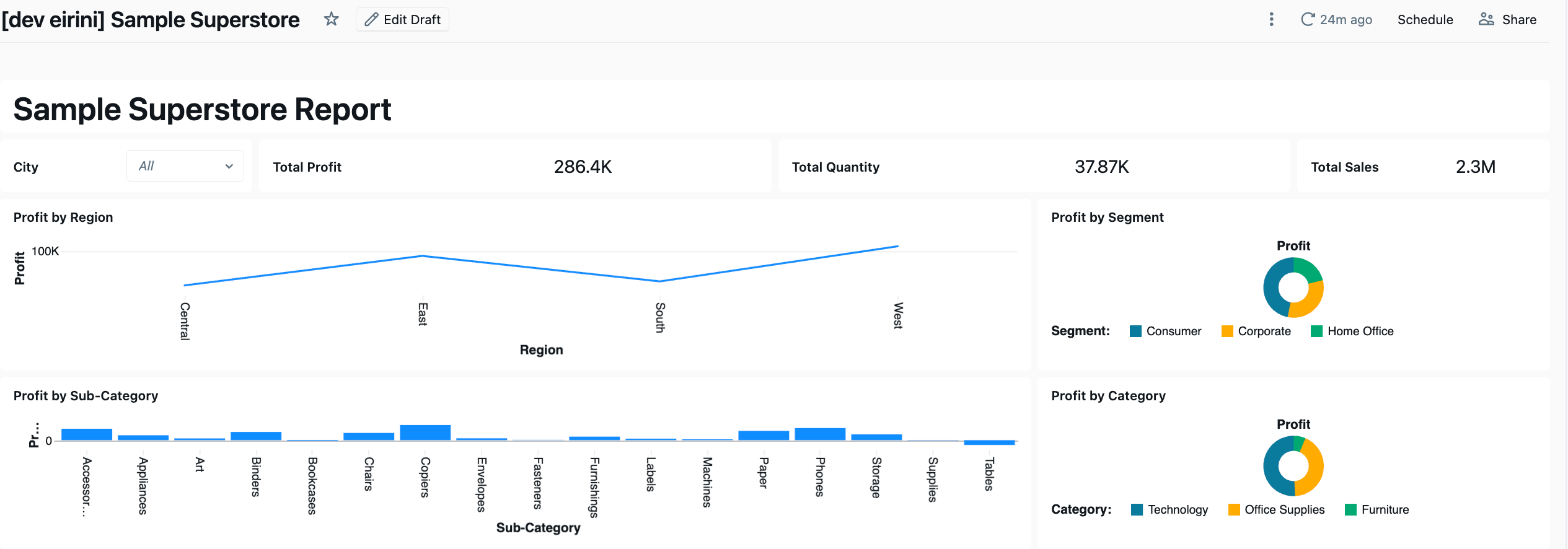
What the Skills File Got Right
Claude read the Power BI source files and generated the dashboard on the first attempt with:
Gauges → Counters: correctly mapped (the skills file documented that Databricks has no gauge — use counter instead)
Single dataset: recognised that all charts use the same table with no
UNION ALLneeded, so one dataset was sufficientCorrect widget specs: version 2 for counters, version 3 for charts, all field expressions correct
City filter: generated as field-based from the start (the skills file had “Do NOT use parameters” clearly documented)
Lessons Learned from Sample Superstore
Skills files work: the patterns from BakehouseSales and AdventureWorks enabled a near-correct first attempt, proving the knowledge base approach pays off.
Gauge → Counter is a visual downgrade: the number is correct, but losing the dial/arc visual is noticeable. Counter sparklines help but are not a full replacement.
Rules need to be explicit: the categorical filter rule was obvious in hindsight, but Claude did not infer it until it was written down. If a pattern matters, document it.
Simple dashboards migrate fastest: no SQL views, no UNION ALL, no multi-dataset filters. A single table with direct aggregations is the ideal case.
Conclusion
Considering the headaches I have seen companies face with the adoption of BI tools, this could be a natural next step. What surprised me most was how straightforward the migration turned out to be. For organisations already running on Databricks, the transformations and aggregations typically already live on the platform BI tools increasingly serve as a visual layer on top. And if the data, the logic, and the governance are all in Databricks already, why not keep the dashboards there too?
The migration itself is not a one-click operation, but it is more feasible than I expected. Across three dashboards of increasing complexity, the core patterns became clear: DAX translates to SQL, Power Query transforms become views, and most standard visual types have a Databricks equivalent. The skills file approach proved its value — what took several iterations on Bakehouse was nearly right on the first attempt by Sample Superstore. And because the skills file captures these patterns as reusable instructions, any user can pick it up and apply it to their own Power BI dashboards without starting from scratch.
There are gaps. Cross-filtering requires explicit wiring that Power BI handles automatically. Table widgets are verbose and break silently. Advanced analytics visuals like decomposition trees and key influencers have no equivalent but these typically belong in dedicated analysis tools rather than operational dashboards. Colour matching and theme alignment are achievable but were not prioritised in this iteration a natural next step for the skills file.
If you have a Power BI dashboard that you think would be a good challenge complex filters, unusual visuals, heavy DAX I’d love to see how it holds up. Try the skills file on your own report and let’s collaborate to improve it. Every edge case we solve makes the next migration easier.